Optimizing the First Fold: A $15k/Mo Design Lift
A holistic refresh of the high-traffic landing page. By shortening headers and prioritizing segment-specific CTAs, we improved engagement across all user categories and boosted annual revenue by $180k.
Role
Lead Product Designer
Impact
+16% Revenue Lift, ~$180,000 Annual Incremental Revenue

Project Overview & Impact
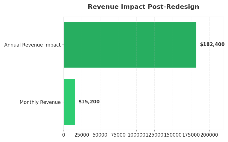
The homepage is the primary gateway for three distinct user segments: Carriers, Brokers, and Shippers. I led a structural redesign focused on Visual Density and Hierarchy. By reclaiming "above-the-fold" real estate and streamlining the header architecture, we achieved a 16% revenue uplift, equating to approximately $15,000 in additional monthly revenue.
The Business Problem (Fold Obscurity)
Data from Hotjar Heatmaps revealed that nearly 40% of users were bouncing without ever seeing our core "Segment Cards" (the entry points to the product).
The Issue: The legacy design featured an oversized hero image and a "heavy" navigation header that pushed critical action buttons below the 768px fold line on most laptops.
Segment Friction: Because the "Carrier" and "Broker" entry points were buried, high-intent users were forced to scroll—a minor friction point that resulted in major drop-offs.
The Design Hypothesis (Real Estate Optimization)
Hypothesis: If we reduce the vertical height of the global header and shorten the hero copy, we can pull the product segment cards "above the fold." This will decrease time-to-interaction and increase the conversion rate for segment-specific signups.
The Strategy: Visual Recalibration
Header Compression: Reduced header padding by 30%, switching from a "branding-heavy" nav to a "utility-first" nav.
Above-the-Fold Priority: Repositioned the Segment Cards so that at least the top 25% of the card was visible on standard 13-inch laptop screens, providing a "visual cue" to scroll.
Action-Oriented Imagery: Replaced static, abstract imagery with "Product-in-Action" visuals that clearly communicated the value proposition of the Load Board.
Data Validation & ROI
The redesign proved that in high-intent SaaS, efficiency beats aesthetics.
Metric | Result |
Incremental Monthly Revenue | +$15,200 |
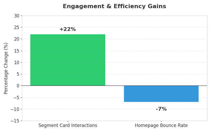
Segment Card Interactions | +22% Increase |
Homepage Bounce Rate | -7% Decrease |
Annual Revenue Impact | ~$182,400 |
Strategic Insights: The "Fold" Still Matters
The Power of Intent: While modern web design often encourages scrolling, high-intent B2B users (like truck drivers or brokers) want to find their "doorway" immediately. Every pixel of "white space" at the top of the page has a literal dollar cost.
Mobile Symmetry: This experiment also improved mobile performance, as the reduced header height allowed the "Get Started" CTA to remain visible while the user began their first thumb-scroll.


Tools & Methodology
Design: Figma (Layout & Prototyping)
Research: Hotjar (Scroll maps & Move maps)
Validation: VWO (A/B Testing)
Principle: Visual Hierarchy & Fitts's Law, Ensuring that the most important targets are the easiest to find and click.
Other projects

The Growth Engine: $80k MRR Carrier Upsell Strategy
Driving $321k+ in total revenue expansion by re-engineering the carrier upgrade path through contextual value-signaling and behavioral design.

Scaling Leads by 375% via Conversational AI
An interactive package selector bot designed to reduce decision paralysis. By guiding users through a personalized funnel, I didn't just improve UX I also, exploded high-intent sales leads.

+166% Revenue Lift: Highlighting Value over Price
A strategic redesign of the pricing grid hierarchy. By injecting contextual pop-ups and emphasizing higher-tier feature benefits, we shifted the plan mix and generated $30k+ in monthly incremental revenue.

World of Haiku
Beginner-friendly cybersecurity RPG