Reducing Decision Friction in a High-Intent Purchase Journey
Users were reaching the pricing page with strong purchase intent but struggled to identify which plan matched their needs. Through user research, behavioral analysis, and experimentation, I designed a lightweight guidance solution that reduced decision friction, improved plan selection confidence, and increased business outcomes.
My Role
Lead Product Designer
Team
Product, Analytics, Engineering, Marketing
Duration
2 Months (Research to Launch)
Type
Mobile & Web Experience
The Challenge
Users were arriving at the pricing page ready to purchase but often struggled to determine which plan best fit their business needs. This uncertainty led to hesitation, incorrect plan selection, and early churn.
My Role
Led discovery, user research, workflow analysis, solution exploration, experiment strategy, UX design, and cross-functional collaboration with Product, Engineering, Analytics, Marketing, and Salesforce teams.
Key Insights
Users didn't need more information.
They needed clearer guidance to identify which option was right for them.
Outcome
11-second reduction in decision time
16% revenue increase
471 additional signups
Improved user confidence during plan selection
Impact
A small change at the right moment created a significant business impact.

The Business Problem
While acquisition efforts were successfully driving traffic to the pricing page, a growing number of users were either selecting the wrong subscription plan or cancelling shortly after purchase.
Initial assumptions suggested a pricing issue.
However, deeper analysis revealed something different.
Users were spending considerable time comparing plans but struggled to understand which option best matched their specific business needs.
The challenge wasn't attracting users.
The challenge was helping them make the right decision confidently.
Who we were designing for?

One insight that stood out across user interviews:
"I didn't think this product was meant for someone like me"
This clearly showed users couldn't see themselves in the pricing page.
How I diagnosed the problem
A mix of qualitative and quantitative research gave us a complete guide.
I started with users, not assumptions. Three research methods, run in deliberate sequence, each adding a layer the previous couldn't prove.
Churn interviews
Spoke with users who cancelled within 60 days to understand why they chose the wrong plan
Survey (n ~1000)
Validated the findings at scale and measured the extent of the problem.
Behavior Analytics (Hotjar)
Analyzed session recordings and heatmaps to identify where users were getting stuck

Research Summary
Using churn interviews, surveys, analytics reviews, and Hotjar session recordings, I identified a consistent behavioral pattern.
Users were not abandoning the pricing page immediately.
Instead, they spent significant time comparing plans before making a decision.
The highest hesitation occurred around the "Recommended" plan row.
This suggested a confidence problem rather than an information problem.
Why I Focused on the Recommended Row?
Multiple research signals pointed to the same area:
Analytics
Users spent the most time evaluating plans in this section.
Session Recordings
Users repeatedly hovered between plans and revisited feature comparisons.
Surveys
Users expressed uncertainty around which plan fit their situation.
Churn Interviews
Many users later realized they had selected the wrong plan.
Together these signals indicated the primary friction point existed at the decision-making stage..
Customer Journey: Emotion Curve & Key Stages
Mapped the emotional experience across 6 stages, before and after the change. Stage 3 is where everything breaks down, and where the design landed.

Stage 3 (Hits "Recommended" row) was the critical friction point, peak confusion for all four carrier types, 45 seconds average hesitation, highest exit risk. The design change targeted this exact moment.
Stage 2
Scans the grid · Partial haulers and new carriers feel the product isn't for them
Stage 3
Hits Recommended row · All 4 personas hit peak confusion here · 45 sec avg.
Stage 6
Early product use · Mismatch surfaces · churn risk highest here
I considered three solutions before recommending one
With the problem clearly diagnosed, I mapped out three possible interventions before making a recommendation:

Ruled out
Full pricing page redesign
High engineering cost, long delivery time, and would change too many variables at once, making it impossible to isolate what actually drove results.
Ruled out
Quiz / plan selector tool
Adds a step before users can see plans. Risks increasing friction rather than reducing it, and introduces a new UX pattern that needs its own testing cycle.
Ruled out
Onboarding overlay
Interrupts the journey before users saw plans. Carriers visiting the pricing page already have intent, stopping them to ask questions felt counterproductive.
Recommended and approved
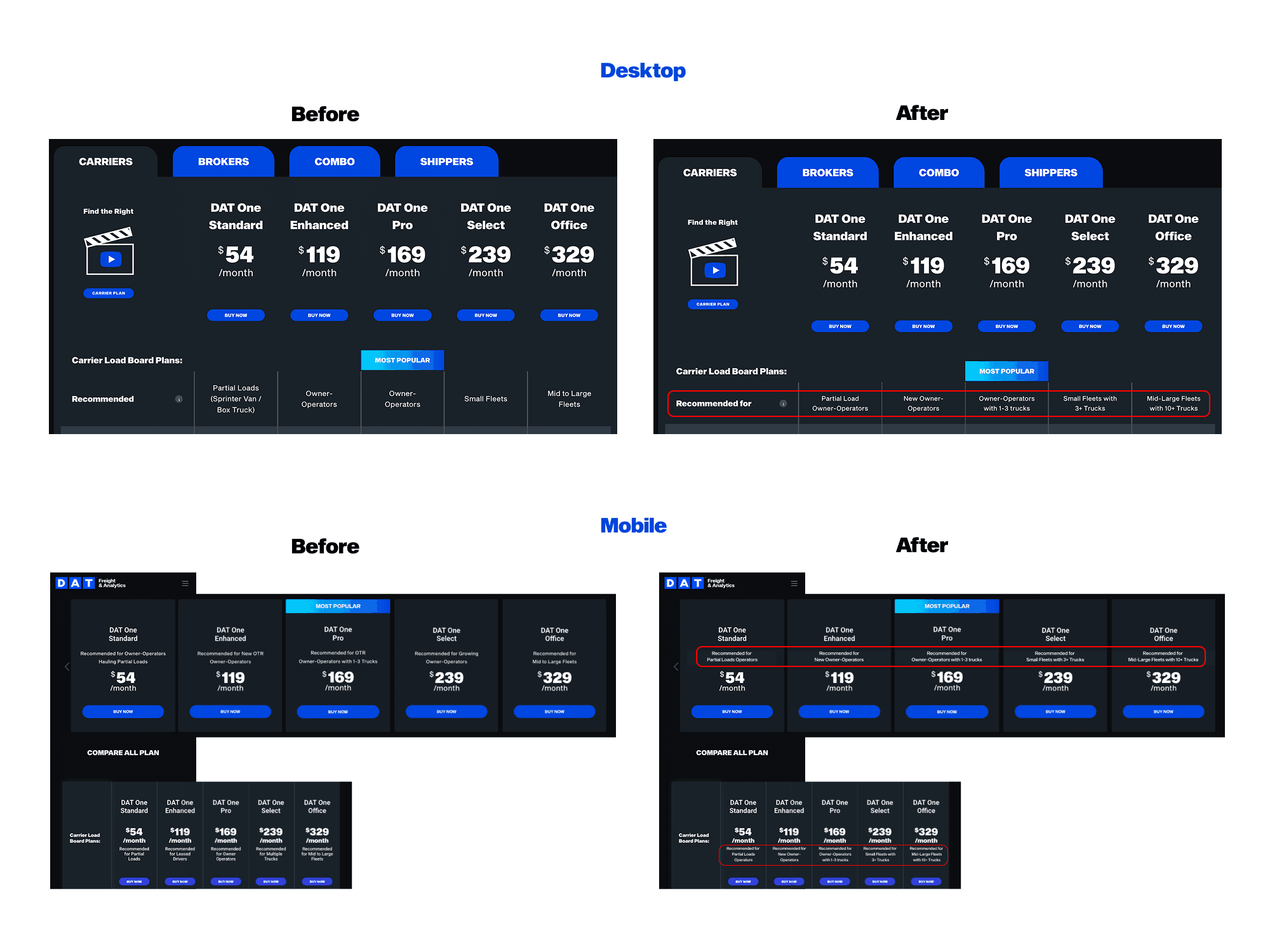
Carrier-size callouts on the existing "Recommended for" row
Surfaces the right information at the exact moment of confusion, with zero additional steps in the journey. Small engineering footprint, fully reversible, and isolates a single variable — making the A/B test clean and conclusive.
Constraints
Four hard constraints shaped the solution. In hindsight, they didn't limit the design, they forced the precision that made the test conclusive.
⏱ Limited engineering time
Engineering was mid-sprint on a separate initiative. We had a maximum of 2 days of dev time, not enough for a full redesign or a new interactive component like a quiz or overlay.
Impact: Ruled out the full pricing page redesign and the plan selector quiz entirely. Pointed us toward the smallest possible intervention.
🔒 Pricing structure was fixed
We couldn't change the 5 plans, their names, price points, or feature sets within each tier. The solution had to work entirely within the existing product architecture.
Impact: Eliminated any solution involving restructuring the grid. The fix had to be purely additive, layered on top of what existed.
↩ Test had to be fully reversible
Any change to the pricing page needed to be rollback-able within hours if results were negative. Structural changes affecting layout, load time, or SEO were off the table.
Impact: Reinforced the callout approach, a text change to a single row is the lowest-risk, most reversible intervention possible.
5 Had to keep all 5 plans as-is
No consolidation, removal, or renaming of plans was in scope. Business and pricing decisions sat outside the design team's remit for this sprint.
Impact: The solution needed to work across all five columns simultaneously, one callout per plan, consistent in style and length.
2 days engineering time · Pricing structure fixed · All 5 plans unchanged · Change had to be fully reversible
"If a minimal, reversible, 2-day change could move revenue by 16% , the problem was never structural. It was always informational."
Trade-offs
Three solutions ruled out, each for a specific reason, not just because of time.

The reframe, constraints as validation, not limitation
It would be easy to frame these constraints as things that limited what we could do. But looking back, they did the opposite, they forced precision. If a minimal, reversible, 2-day change could move revenue by 16%, it proved the problem was informational, not structural. We didn't need to rebuild the pricing page. We needed to surface the right information at the right moment. The constraints kept us focused on that insight rather than letting us default to a bigger solution that would have been harder to measure and slower to ship.
"The smallest intervention that addresses the root cause is always better than the largest intervention that addresses a symptom. The constraints didn't limit the solution, they validated it."
I recommended it, aligned stakeholders, and defined success upfront
I presented the three options to the PM with a clear recommendation: the callout approach addressed the root cause, fit within engineering constraints, and produced a clean test signal.


The Design Hypothesis
If users can quickly identify which plan is designed for people like them, they will make decisions faster, select plans more confidently, and be more likely to choose the right plan from the beginning.
The design focused on reducing cognitive effort rather than adding more information.

Validation & Results
The solution was validated through an A/B experiment with a 50/50 traffic split.
User Outcomes
Reduced decision time by 11 seconds
Faster plan identification
Increased confidence during selection
Business Outcomes
16% increase in revenue
471 additional signups during the experiment period
Improved conversion performance
Product Outcome
Users were able to understand which plan matched their needs without requiring additional steps, education, or workflow changes.
Key Learnings
Users Need Confidence More Than Information: Adding more features, comparisons, or content would not have solved the problem. Research showed that users already understood the available plans but struggled to determine which option best fit their situation. Providing contextual guidance proved more effective than increasing information density.
Decision Friction Often Hides Behind Engagement Metrics: Initially, longer time spent on the pricing page appeared to indicate engagement. However, deeper analysis revealed that users were experiencing uncertainty rather than confidence. This reinforced the importance of combining behavioral analytics with qualitative research before drawing conclusions.
Small UX Changes Can Create Significant Business Impact: The final solution required minimal engineering effort and no major workflow changes. By focusing on a specific decision point within the journey, we were able to improve user confidence, reduce decision time, and generate measurable business outcomes.
What I Would Explore Next
If given additional time and resources, I would explore:
Personalized Plan Recommendations: Behavior-driven recommendations based on user profile and intent.
Onboarding-Based Guidance: Helping users discover the best plan before reaching pricing.
AI-Assisted Plan Selection: Interactive recommendations tailored to user business size and goals.
Methods & Design Principles
To understand the problem and validate solutions, I combined qualitative research, behavioral analytics, and controlled experimentation.
Research Methods
User Interviews
Customer Feedback Surveys
Hotjar Session Recordings
Journey Mapping
Behavioral Analysis
Analytics & Validation
GA4 Event Tracking
Funnel Analysis
VWO A/B Testing
Design Execution
Figma
Information Architecture
Wireframing
Interactive Prototyping
Design Principle Applied
Cognitive Load Reduction
Decision Confidence
Progressive Guidance